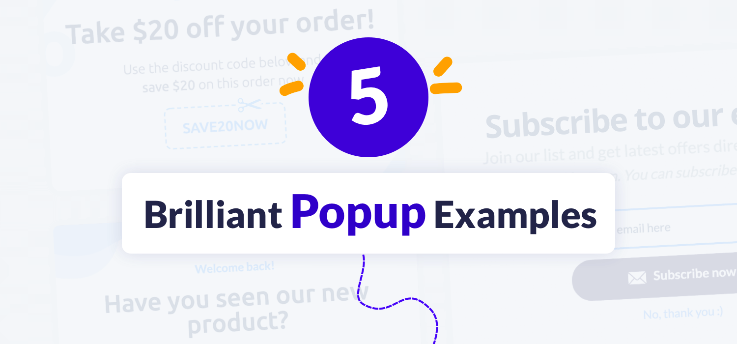
5 Brilliant Popup Examples That Have Actually Helped Businesses
- Introduction
- 5 of the Most Brilliant Email Popup Examples You Can’t Afford to Miss Out On
- Sigma Beauty
- Sitepoint
- Basic Outfitters
- WorldOfWatches
- Gaiam
- Conclusion
Introduction
Data fetched from a report indicates that most websites are subject to bounce off rates of anywhere between 26% and 70%.
And while the bounce off rate of a website depends on many factors like business model, industry, website speed, user interface, user experience, if you want your website visitors to take the desired action before their bounce off, we’d recommend you add a conversion-focused popup to your website.
From helping you skyrocket your conversion rate to grow your email list, website popups, when used correctly, can be extremely powerful.
As a business owner myself, I understand how hard yet critical it is to build a high-quality email list from the ground up.
For every dollar you spend on email marketing, you can expect an average return of $42. That’s a staggering 4,200% ROI.
Some of the benefits of building an email list include:
- Roll Out Personalized Emails to People That are Likely to Purchase Your Products or Services
- Build Trust
- Position Your Brand as Trustworthy & Credible
- Engage Prospects & Customers at Different Stages of their Buyers’ Journeys
- Boost Conversion Rate
- Increase Brand Awareness
- And more!
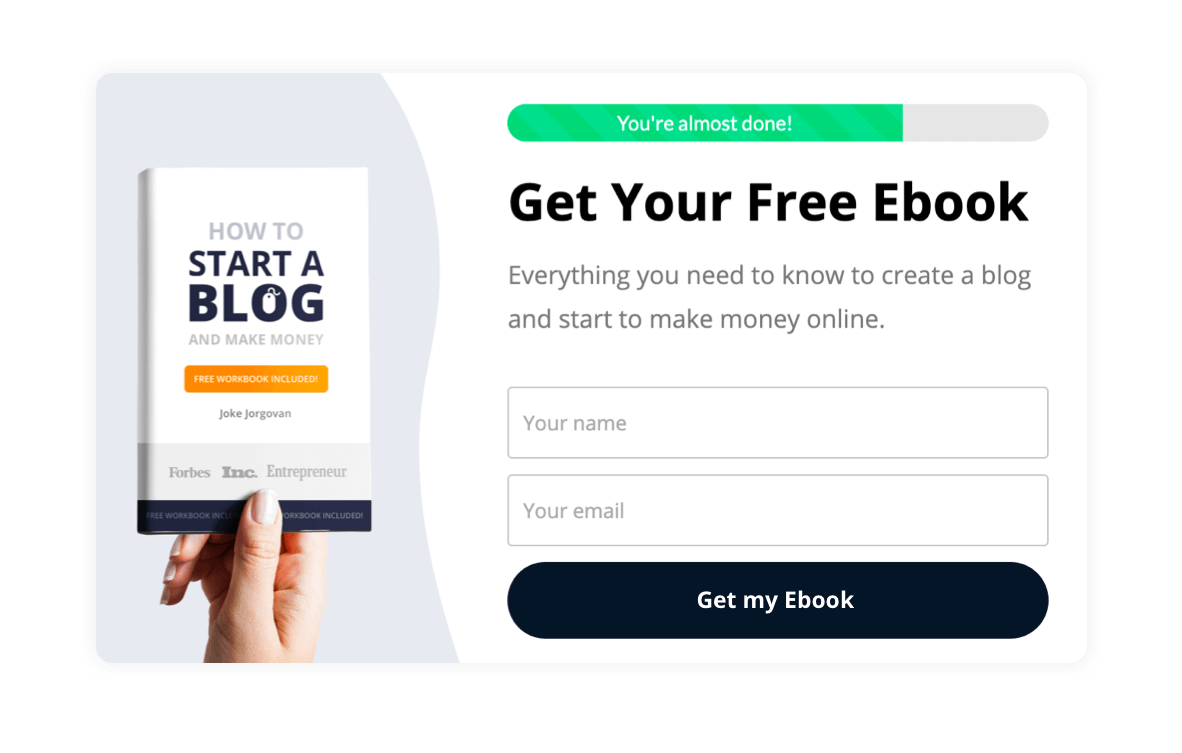
So, if one of your top priorities is building a healthy email list, we’d advise you to add a highly converting popup to your website like this one:
While popups can help you hit your KPIs, it’s important to make sure that they are outstanding - popups that manage to catch your audience’s attention and make them take the desired action.
At the same time, these popups should not affect the overall user experience and website performance.
We’ve personally witnessed hundreds of brands put their email list on hyper-growth mode by adding conversion-focused popups on their website.
And if you’re looking forward to doing the same, allow us to present five brilliant email popup examples that you can take as inspirations.
Let’s dive straight into these examples.
5 of the Most Brilliant Email Popup Examples You Can’t Afford to Miss Out On
We literally reviewed and analyzed 300+ popup examples and prepared our five list, which includes:
- Sigma Beauty
- Sitepoint
- Basic Outfitters
- WorldOfWatches
- Gaiam
Let’s dive deeper into these email popup examples one by one.
Sigma Beauty
In my opinion, Sigma Beauty’s website is one of the most visually appealing Magneto websites to date.
And it’s not just the good design that caught my attention.
Two of the other big reasons that make their website stand out include:
- Impressive Performance
- Smooth Navigation
And let’s not forget their brilliant discount popup that goes so well with their design.
Here’s what it looks like:
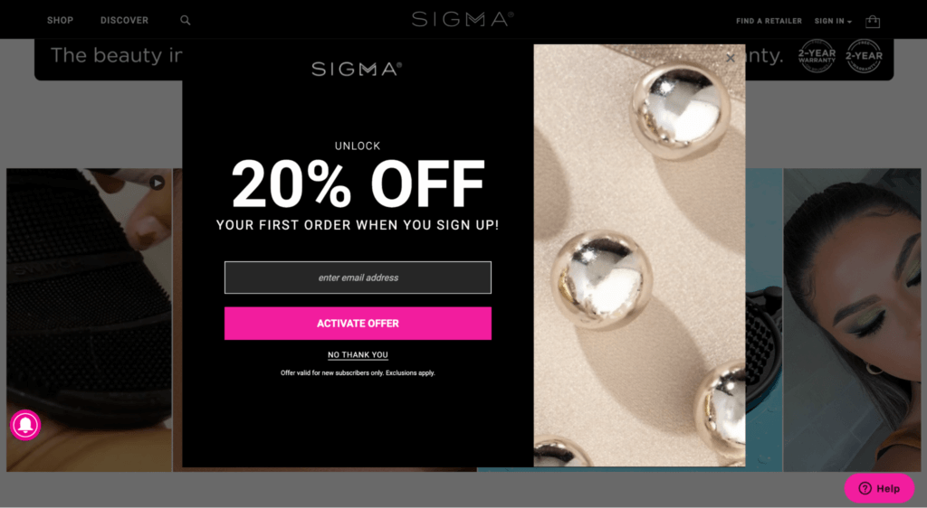
The reason why it converts so well, apart from its unique design, style, and structure, is that - in exchange for the 20% discount, they have one input field. That “enter email address.” Nothing else.
The fewer the input fields on an email popup, the higher will be the chances of your website visitors submitting them.
Apart from the advantage of having just one input field, two other reasons why their email popup converts so well include:
Brilliant Copy – Not many people will realize this – but the copy on the email popup is just brilliant. It’s on-point, engaging, and is fluff-free. One of the big reasons why some businesses fail to achieve the desired results upon adding email popups is that they add too much fluff to it. Here, the copywriter has clearly mentioned that you can unlock an impressive 20% discount on your first order. Nothing more! Nothing less!
Clearly Mentions Who the Offer is For – This popup clearly mentions who the offer is for. Here, it’s clear that Sigma Beauty is laser-focused on customer acquisition over retention. Maybe, they already have a good customer retention rate. So – they have clearly mentioned that this offer is only for people who’re placing the order for the very first time.
Sitepoint
And not always do you need to have a popup that automatically puts itself in front of your website visitors after a few seconds of them landing on the website or while they’re trying to leave. Instead, you can use a top banner popup just like Sitepoint did:
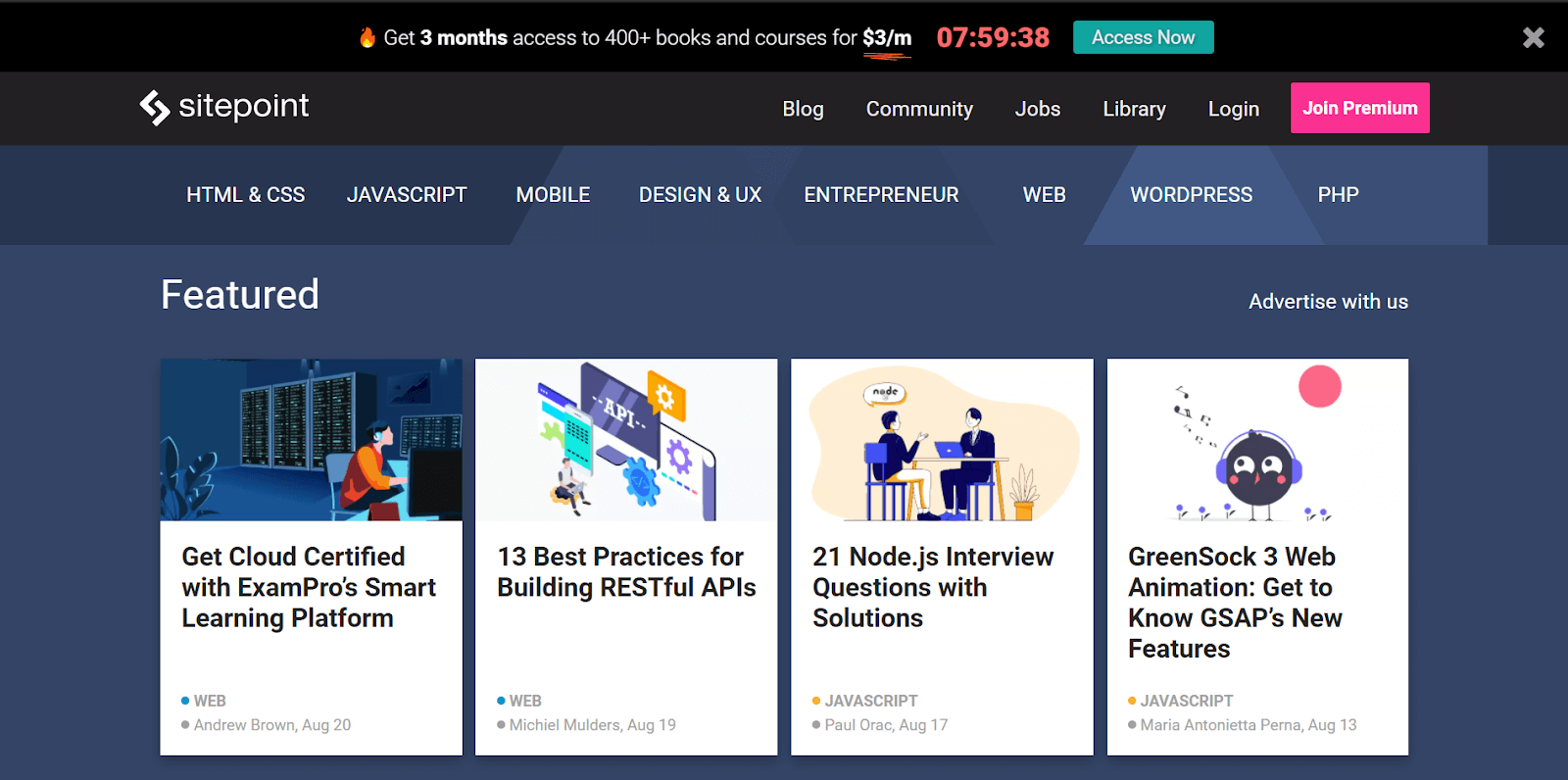
The thing about normal popups is that sometimes they can turn out to be disturbing and frustrating. And let’s not forget that they may ruin your overall user experience if not used correctly.
To avoid the disturbing factor of the normal popups, you can always add a top banner popup – where you can not only convey your message in one line but also have a section for your audience to submit their contact information.
One of the minus points of adding top banner popups to your website is that you won’t be able to add any visuals. So – it’s just the copy, font style, font color, and your offer that you’ll have to rely on to achieve your goal.
Sitepoint has done a brilliant job of mentioning what they’re offering in just one line. And having a timer next to your copy is just brilliant – which is something you can take into consideration as well – depending on your offer.
Here, they have added an “Access Now” button. However, since our goal is to capture emails and build a healthy email list, I’d suggest you have one or two input fields, followed by a “Submit button.”
Basic Outfitters
Did you know that it takes around eight touches to turn your first-time website visitors into paying customers?
This means – a majority of your first-time website visitors will leave your website without purchasing your product(s) or service(s).
And if they are leaving your website, that doesn’t always mean that they are uninterested. Maybe, they need some time to think. Or maybe they are just exploring more options.
Whatever the reason, you need to make sure that you are putting your brand in front of them as many times as you possibly can to make a sale. But in order to put yourself in front of them, you need to have their email. And that’s what Basic Outfitters have done a brilliant job at.
Here’s their email popup:
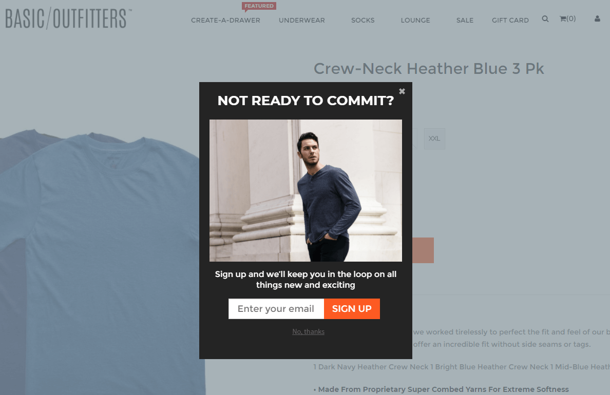
As we mentioned before, not all website visitors are ready to purchase. And they have done a clear job at mentioning it to their consumers by mentioning “Not Ready to Commit?”
From a catchy headline to letting the audience know that they want to keep them in the loop to a brilliant design, Basic Outfitters has done a brilliant job at building a conversion-focused email popup that doesn’t even require them to give their customers a discount.
WorldOfWatches
Love watches and at the same time a $10 discount? At PrettyLead, we’re strictly against Full-Page Popups. But when implemented right, you can achieve outstanding results – that’s what WorldofWatches have shown us.
Here’s what their popup looks like:
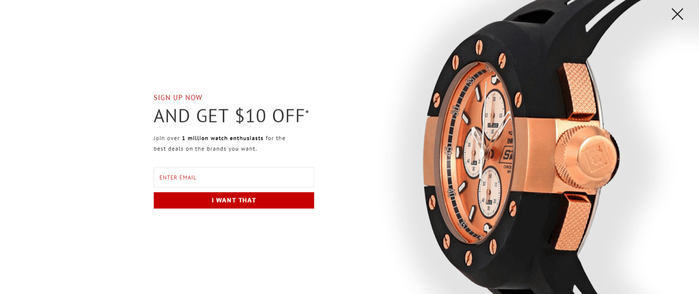
As you can see, it’s simple and conveys the message in a clear-cut manner. At the same time, it doesn’t look cluttered and has just one input field. Additionally, if you dive a bit further, even though it’s a full-page popup, we don’t think that it ruins the overall user experience.
In fact, I love the watch they chose to put in front of their audience in their full-page popup.
That, along with a clear message – I guess watch lovers will face a real hard time resisting this email popup.
Gaiam
You’ll see most popups to be rectangular or square-shaped. But Gaiam’s email popup does a great job at catching its audience’s attention with its unusual shape and structure. Here’s what the popup looks like:
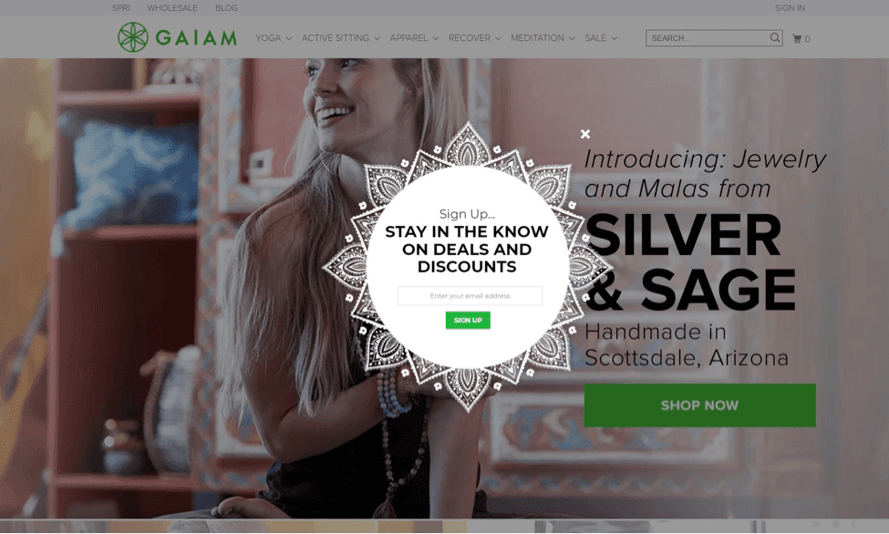
As you can see, not only is the shape unique, but it also goes well with the brand’s overall look and feel. At the same time, they have conveyed the message that they’ll be rolling out deals and discounts via email.
So – if you are someone who may be interested in different deals and discounts and loved the experience on the Gaiam website, I guess there’s nothing that would stop you from submitting your email
From the unique shape to minimal on-point copy to one input field, Gaiam, in my opinion, has knocked their website email popup out of the park.
Conclusion
Not all your website visitors may be ready to purchase your product(s) or service(s).
Some may have landed on your website for the very first time.
Whereas others may be ready to make a purchase.
Different customers are at different stages of their customers’ journeys. And if you want to turn them into high-quality leads, adding conversion-focused email popups – popups with a great design, a mind-blowing offer, on-point copy - is a brilliant way to achieve your goal.
With PrettyLead, you can customize and launch your email popups in minutes, all thanks to the advanced and powerful drag and drop visual builder and over 50+ pre-built templates. So, what are you waiting for?


